Blog
Everyone needs to know how to choose fonts because the way type is presented on the page is just as important as the color palette, layout, or other design elements. The space between the lines or “Leading” should be set high enough to avoid the appearance of jumbling yet low enough to indicate the continuation of one line or sentence. A larger leading with lots of white space between lines will make the text feel easier to read; a smaller leading can create a crowded feeling and is harder to read especially on mobile devices.

Like your website, every typeface has its own personality that can create a certain “mood” or “feel”. There are fonts that impart a more serious design for business, casual fonts for stories, playful, elegant, or signature fonts for just about any project available. You’ll need to determine what a particular font means to you and whether it would add value that would fit with your design.
There are four different kinds of typefaces that may or may not be fitting for your website. Here’s a short description of each:
Serif Fonts – These fonts feature letters that have short lines coming off of the corners and edges. They are generally considered to be more formal and/or traditional.
These kinds of typefaces are best suited for printed projects like newspapers.
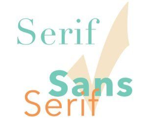
Sans-serif Fonts – These fonts feature letters that do NOT have the short lines coming off the edges. Their design is more smooth and sleek. These kinds of typefaces are generally used for the web, informal elements, or to add a bit of a playful feel. They are best suited for digital projects.
Script Fonts – Script typefaces look like handwriting and they’re often used in formal invitations or for email signatures. They are not as legible in smaller sizes and are not the best choice for the body of a website.
Decorative Fonts – Informal fonts viewed as original. Best suited for headlines but not body copy, decorative fonts are rarely used for blocks of text. They sometimes contain symbols or flairs that convey specific information or add to the overall theme of the website.

By today’s viewing standards, the most popular size for a website’s body text online would be 20px – 22px. For the web, like all other elements, keep in mind that each typeface you use on your site requires the download of a file. The more fonts you use, the more files there are to download and the longer it takes for your page to load. A website usually looks fine with two fonts… one for body copy and another for titles and headers. When you really need to differentiate between various elements on the page using text, you can still do so by simply adjusting colors, weights, and sizes.
Line lengths, when left to reflect natural speaking, are usually okay just the way you would type them. If the line length is too short however, your reader’s rhythm will break because their eyes have to travel back to the left of the page again. A line length that is too long makes it hard to find where lines of text start and end and can confuse the reader. It can make it difficult to get to the next line without accidentally jumping to the wrong place in the story.

White space or space above and below paragraphs, page margins, and the space between text and other elements on a website should be provided to eliminate crowding. Sentences and paragraphs that are too close together are harder to read even with larger font sizes. Leave margins to the left and right of the text and images as well as the edges of the page to create a more enjoyable reading experience. Even readers with imperfect vision can digest the copy faster when the line heights are set to at least 1.5.
Kerning refers to the space between two letters. You can adjust the kerning in order to improve the appearance while also enhancing readability. Kerning that is too tight will make words difficult to read, however, a kerning set too large will make it hard to differentiate between words, as the letters will appear completely disconnected from one another.
Tracking can sometimes be confused with kerning because it relates to adding space in between letters, however, whereas kerning adjusts the spacing between two letters, tracking is used to adjust spacing across a line. Tracking is used to fix density issues while reading.
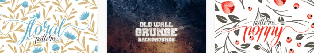
Examine the usage examples above by themefire. They use different font styles with colors and accompanying graphics to achieve the appearance that best fits their product packaging. The fonts that you choose help to define the look and feel of your website a lot like the paint job on your car. Would you like purple sparkle flake for an exciting and unique flair or something more corporate like a smooth black or blue with high gloss? Think about the kind of impression that you want your website, product package, or branding to make and choose the appropriate font from there. Ensuring that your font fits your site’s brand and genre will also ensure that your visitor gets the proper impression of your company’s background, age, and overall relevance. One of our favorite sources for free and beautiful web fonts is Google Fonts.
What’s your favorite font and why? Email us your opinion at info@eliyahna.com. We’d love to hear from you! <3