Category: Graphic Design

  • Hex Colors or Hex Triplet Coding Your Web Palette

    Hex Colors or Hex Triplet Coding Your Web Palette

    Hex colors or a hex triplet is a six-digit, three-byte hexadecimal number used in HTML, CSS, SVG, and other computing applications to represent colors.

    (more…)
  • Unleashing the Potential of Color Psychology

    Unleashing the Potential of Color Psychology

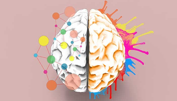
    In the digital age, where visual content reigns supreme, graphic design plays a pivotal role in capturing attention, conveying messages, and leaving a lasting impression on users. While aesthetics and creativity are crucial aspects of graphic design, another often overlooked element that significantly impacts user experience and perception is color psychology. Understanding the influence of colors on human emotions and behavior is a powerful tool for creating compelling designs that engage and resonate with the target audience.

    The Basics of Graphic Design

    Graphic design encompasses a wide array of visual communication techniques that involve creating and combining various elements such as images, typography, and colors to convey a specific message or evoke certain emotions. It is the harmonious blend of these components that brings a design to life and captivates the viewer.

    The Intricate Connection Between Color and Psychology

    Colors have the remarkable ability to evoke emotions, influence mood, and shape perceptions. They can convey meaning, communicate messages, and establish brand identity. Let’s delve into the fascinating world of color psychology and explore how different colors impact human cognition and behavior.

    1. Red: Passion and Energy

    The color red is synonymous with passion, energy, and intensity. It grabs attention and elicits strong emotions. Brands often use red to create a sense of urgency or excitement. However, it’s important to exercise caution while using red excessively, as it can also signify danger or aggression.

    2. Blue: Trust and Stability

    Blue is known for its calming and trustworthy qualities. It conveys a sense of security and stability, making it an ideal choice for corporate brands. Lighter shades of blue can evoke feelings of tranquility, while darker blues can symbolize strength and authority.

    3. Yellow: Optimism and Happiness

    Yellow is associated with joy, optimism, and warmth. It radiates positivity and is often used to draw attention or convey a sense of cheerfulness. However, excessive use of yellow can be overwhelming and create feelings of anxiety or caution.

    4. Green: Harmony and Growth

    Green is closely tied to nature, symbolizing growth, harmony, and balance. It is often used to promote environmental causes or products related to health and well-being. Lighter shades of green can evoke a soothing effect, while darker greens represent wealth and abundance.

    5. Purple: Creativity and Luxury

    Purple has long been associated with royalty, luxury, and creativity. It carries an air of sophistication and elegance, making it an excellent choice for brands that want to portray a sense of uniqueness and exclusivity. However, overusing purple can create a sense of arrogance or extravagance.

    6. Orange: Energy and Vitality

    Orange is a vibrant and energetic color that stimulates enthusiasm and excitement. It is often used to create a sense of urgency or draw attention to specific elements. Orange is also associated with affordability and can be an effective color choice for brands targeting budget-conscious consumers.

    7. Pink: Femininity and Playfulness

    Pink is widely recognized as a color associated with femininity, tenderness, and playfulness. It is often used in designs targeting a female audience or to evoke a sense of sweetness and romance. However, it’s essential to consider cultural connotations of pink, as it can vary across different societies.

    8. Black and White: Simplicity and Sophistication

    Black and white are classic color choices that represent simplicity, elegance, and timelessness. They create a high contrast, allowing other design elements to stand out. Black exudes power and authority, while white signifies purity and cleanliness. The combination of black and white can create a sophisticated and modern aesthetic.

    Applying Color Psychology in Graphic Design

    Understanding the impact of colors on human psychology allows graphic designers to strategically incorporate them into their designs for maximum effect. Here are some key considerations when applying color psychology in graphic design:

    1. Branding and Identity

    Colors play a vital role in shaping a brand’s identity. By carefully selecting colors that align with the brand’s values and personality, designers can create a strong and consistent visual representation. Consistency in color usage across different marketing materials and platforms helps build brand recognition and establish a memorable brand image.

    2. Target Audience

    Consider the preferences, cultural backgrounds, and demographics of the target audience when choosing colors for a design. Different colors evoke different emotions and have varying connotations across cultures. Tailoring the color palette to resonate with the intended audience enhances the design’s effectiveness and strengthens the connection between the brand and its consumers.

    3. Mood and Tone

    Colors have the power to set the mood and tone of a design. For example, warm colors like red, orange, and yellow can create a sense of energy and excitement, while cool colors like blue and green can evoke calmness and serenity. Understanding the desired emotional response from the audience allows designers to select colors that align with the intended mood and effectively convey the desired message.

    4. Contrast and Readability

    Contrast is crucial in graphic design to ensure readability and visual hierarchy. By using contrasting colors, designers can make important elements stand out and guide the viewer’s attention. High contrast between text and background improves legibility, especially in digital interfaces. Consider the accessibility aspect as well, ensuring that color choices accommodate individuals with visual impairments.

    5. Harmonious Color Schemes

    Creating harmonious color schemes is essential for a visually pleasing design. Designers often use color theory principles, such as complementary, analogous, or monochromatic color schemes, to create balanced and cohesive visuals. Harmonious color combinations enhance the overall aesthetics and make the design more visually appealing.

    Graphic design is an art form that goes beyond mere aesthetics. By harnessing the power of color psychology, designers can create visually compelling and emotionally engaging experiences for users. Understanding the impact of different colors on human perception and behavior allows designers to communicate messages effectively, establish brand identity, and forge a connection with the target audience.

    Remember, while color psychology is a valuable tool, it is important to consider other factors such as user experience, content quality, and website performance to achieve optimal search engine rankings. Incorporating these elements in conjunction with thoughtful and strategic graphic design can elevate your online presence and set your website apart from the competition.

  • How to get the best out of your Graphic Designer

    How to get the best out of your Graphic Designer

    How to get the best out of your Graphic Designer

    Over the years, I’ve been through many different types of projects with graphic designers. I’ve seen project managers using various methods in working with graphic designers that either flew or flopped

    (more…)
  • What is Eliyahna Creative, LLC.?

    What is Eliyahna Creative, LLC.?

    Eliyahna (E-lee-YAH-nuh) Creative provides professional services to small, medium, and large businesses all over the world, remotely. Some of our services include custom web development, web design, graphic design, video editing, intros, outros, jingle creation, application development, website hosting, package design, search engine optimization, social media marketing, pay-per-click management, and website maintenance and security.

    SeedEliyahna Creative began in the late 1990s as a web and graphic design resource for Yahoo and first-time website owners… mainly creating advertising banners and providing website coding. Over the years, managed and unmanaged hosting was added as well as more complex offerings like custom scripting of interactive elements. At that time, most elements were handwritten in Javascript or CGI scripting with database or XML driven interactions.

    As time progressed, social media post design packages were added to the menu for beautified and royalty-free postings on Facebook, Twitter, and/or LinkedIn. Facebook targeting and using Facebook Pixel on new websites enabled the ability to push the ads to highly targeted audiences as well as past site visitors. Ad publishing, tracking, and analytics have become one of the most popular services we provide still today.

    Websites are always the number one resource for good modern business exchanges… building them, maintaining them, and designing them for the highest return on investment is still our highest requested product or service. New websites on our VPS server normally include one-year hosting and maintenance to ensure satisfaction and functionality including software updating and regular testing of interactive elements like forms or shopping carts.

    Business GrowthEliyahna Creative provides the creation and integration of animated graphics, 3D modeling, UX design, and video editing. We’ve had the privilege of working on projects for fortune 500 company’s as well as designing pitch-decks for people with brand new ideas. While creating custom designs and coding up elements that provide interactivity is a lot of fun, the best part is seeing them help businesses grow by improving relationships with customers and by increasing conversion numbers with new traffic. The lasting relationships we forge with our fellow business owners, whether local or worldwide, are symbiotic catalysts that work to generate success on a day to day basis, all year long.

    Advertising agencies are often asked to provide web development, even though they only have the staff for print or digital design. They come to us for white-labeled services that are fast, reliable, and responsive to their clients’ needs. We meet deadlines, make revisions, and even provide consultation for new and existing web and advertising campaigns. All of our design and development services are geared toward conversion on sales and reservations. Branding, logo design, and package designs are created on demand that couple with advertising and social media marketing to make a rounded out campaign that has all of the pieces required to get the whole return.

    Our graphic designs and websites can be seen in many genres from law to retail and everything in-between. It’s an awesome way to meet people in many different businesses and geographical areas and we love learning about each one individually. We take the time to ensure that we properly identify and solve problem elements so that you get the highest return on investment possible. Contact us about your website or business goals today. We’d love to help your business grow!

  • How to use shapes to shout out loud

    How to use shapes to shout out loud

    Using shapes to shout out loud

    A great deal of thought goes into the shapes and colors used in web and graphic design techniques for good reason. Different colors and shapes tend to convey certain tone or might even make the viewer feel a certain way. Every product, service, or campaign works to engage some sort of specific audience genre… whether it be a certain age group, gender, or a group of people who live in a specific geographical area. Some projects will require a timid or soothing approach, while others should convey power or aggression and excitement. Different shapes convey different moods and emotions. What kind of tone should your project convey? Who is your preferred audience and what kind of reaction are you working for?

    Shouting with ShapesMany studies have shown that people are generally more comforted by curves. Rounded shapes tend to send a positive emotional message of harmony and protection. The circle is often used in a logo to represent unity, commitment, love or community. So to comfort your viewers, you may wish to employ imagery that uses curved edges and borders instead of straight and square. When tested or surveyed in many cases both men and women preferred the look and feel of softer curves and edges on product package designs and architecture.

    Circles are most frequently used to represent things that create a sense of completeness. Because Circles do not have a beginning or end, they imply movement. This shape is also sometimes thought to suggest infiniteness and harmony. In web design, circles are often used as the go-to shape for buttons or call-to-action icons. Use of a circle in a project typically brings immediate attention to that element because the shape is not so commonly used. Circles, ovals, and ellipses tend to project a positive emotional message. Using a circle in a logo can suggest community, friendship, love, relationships and unity. Curves and circles tend to represent:

    • Completeness
    • Eternity
    • Femininity
    • Intellectualism
    • Love
    • Movement
    • Protection

    Not to be outdone, squares and rectangles express being grounded and stability when used in a design.

    Shouting with shapesRational and practical, squares and rectangles have straight lines and right angles with a very mathematical and balanced feel. Shapes and straight edged lines found in squares, rectangles, and triangles suggest professionalism, efficiency, and stability appealing to the left brain of the audience. They create a feeling of balanced practicality and used with colors like orange, red, and blue, they can create feelings that are bright and modern. Straight-edged logo shapes such as squares and triangles suggest stability in more practical terms and can also be used to imply balance. Straight lines and precise logo shapes also impart strength, professionalism, and efficiency.

    Triangles represent power, progression, strength, purpose, and direction. Almost every use of a triangle implies motion toward a specific direction. Typically, the viewer’s eye is drawn to the widest part of the shape first and then follows it to the point. One of the most common uses for triangles in design projects would be when they are used as directional or navigational tools to guide the eye or mouse direction. Triangles are often small in comparison to the canvas and can sometimes be joined together in a sort of grouping to create a dynamic image or houndstooth background design. Straight edges with sharp corners represent:

    • Aggression
    • Boldness
    • Courage
    • Domination
    • Equality
    • Formality
    • Growth
    • Honesty
    • Masculinity
    • Order
    • Rationality
    • Security
    • Stability
    • Trust
    • Uniformity

    Using both squares and rectangles in graphic design creates a perception of power and strength.

    Shapes In DesignWhen those are mixed with other media featuring rounded contours, a sense of balance and reliability is created. Curved Lines can evoke a more feminine reaction akin to happiness, generosity, and a sense of rhythm. When they are used together with some angular lines, they can present a sense of innovation like that in the Nike “swoosh” logo. Most projects use shapes in such a way that you don’t even really see or think about the shapes. They are combined and integrated into the perfect places with appropriate coloring in order to maintain design flow.

    This is how shapes should be used. Using variances to draw the eye through from the beginning of the media to the intended conclusion makes for a perfect arrangement and usage of shapes.

    For best results when working to choose shapes and colors for a campaign, determine your audience, what tone will garner the reaction you require, then apply the shapes and colors that would best suit your overall purpose in advertising both on and offline for the highest conversion and return on investment.


  • Monumental Fundamentals for Colossal Branding Magic

    Monumental Fundamentals for Colossal Branding Magic

    There are many key factors to branding success but as long as you’re doing a lot of business, who cares? Why is branding important?

    I could re-hash how a branding logo is your business’ first impression and how it should convey the meaning or message of your products or services in a memorable way… but most of us already know this. The online marketing systems that many countries enjoy have enabled the emergence of a plethora of new entrepreneurs, start-ups, and merging conglomerations that crowd one another out. Most internet searches return pages and pages of results… full of businesses ready and willing to provide services. Some of them are applicable to your requirements and some are not. It’s important to make a relevant business stand out, again, in a memorable way… but that doesn’t always depend on the logo.

    A brand is comprised of much more than just a logo.

    Here’s the magic… a brand is the total sum of your business including Rehashproducts, services, values, and identity. A branding logo is an intangible asset featuring a name and/or design that identifies one seller’s product from another and is often a corporation’s most valued asset. It can be exciting to learn the real meanings behind some of the most recognizable branding logos for employees and customers alike. Your brand is your promise! The logo’s meaning should give pride and direction to the company staff and familiarity as well as relatability to the customer. It’s been estimated that over 60% of people cite shared values as the main reason they have a relationship with a brand. Our logo at Eliyahna Creative features a dragonfly. Dragonflies are sensitive to direction and use the wind’s power to quickly fly to improved environments. As a business, we also direct our efforts toward creating better environments for increased business productivity quickly with improved return on investment. Our dragonfly has changed in design quite a few times over the years but has remained a consistent part of our branding.

    Logo MagicConsistency in branding is very important but not at the expense of proper design. If your logo is at least three years old and the design hasn’t been revisited or repolished, you should take a second look at the possibilities that a redesign could afford you. Most times the old content can just be rearranged or altered to provide a brand new “look” and improved or more modern “feel”. Swapping logo designs to fit with every art trend, however, is not recommended. Ask a few strangers and/or consult a professional designer about what kind of impression your design makes to a new viewer. Many logos feature a really outdated look but the owners have become so accustomed to it that they are completely unaware.

    The logo is more than that thing on the top left corner of the page.

    Many viewing devices such as Apple or Android phones and tablets provide the visitor with a way to save your logo or icon as a quick link back to your website or app. This is where it pays to consider what your logo or logo icon will look like when it’s half the size of a postage stamp. Will it still be recognizable? The best logo options are the ones that provide consistency over every platform at least to the extent that they are highly recognizable at any size. That can mean that you might have to envision it with no text at all. What would be left if you removed the text from your logo? Would the remaining design bring your business to mind right away to return viewers?

    We all know it’s great to have both light and dark versions of a logo design available but you should really avoid a black & white logo design. Black is almost always used for text, whether it’s online or in print. As a result, your black logo will fade right in and disappear. The same problem applies to just white. Color increases brand recognition by up to 80%. Colors have different meanings in different cultures and geographical areas so it’s best to choose from those that would be meaningful to your target audience.

    Logo ColorsA strong, recognizable brand that customers trust helps ensure future business, consistently building the value of your brand and, ultimately, your financial return. Don’t believe that if your reputation precedes you that your name is enough. Without a presentation of your logo to symbolize your company tone, a potential customer will attribute whatever they imagine themselves. There is a modern design principle that states that form follows function. What that means is that a good design should not just attract attention, it should serve a purpose. Color is the most highly recognizable aspect used in branding and big names in business have fought in court over the rights to advertising in certain colors. Colors influence our natural senses the most, followed by shapes, then symbols, then words. At the heart of branding is the promise that is made by the organization to the audience. The brand promise tells the audiences who you are, what you believe in, and what unique value you provide. The ability to fulfill your promises at every stage of the relationship is the defining factor for most organizations’ success or failure.

    Even though consumers form an impression about a business within 10 seconds of viewing their logo, it takes 5-7 impressions for someone to remember a branding logo. A consistent presentation is certainly key as well as great customer service. More people buy from businesses they were referred to by a friend or family member than other familiar businesses. For Millennials, 62 percent believe that online content drives their loyalty to a brand. Also, to gain brand loyalty from Millennials, it’s vital to share your content over social media. Almost 90 percent of marketers say their social marketing efforts have increased exposure for their business, and 75 percent say they’ve increased traffic. However, only 32% of small businesses invest in social media marketing. (Social Media Examiner, 2016) So don’t forget to share, share, share!