Blog
In the digital age, where visual content reigns supreme, graphic design plays a pivotal role in capturing attention, conveying messages, and leaving a lasting impression on users. While aesthetics and creativity are crucial aspects of graphic design, another often overlooked element that significantly impacts user experience and perception is color psychology. Understanding the influence of colors on human emotions and behavior is a powerful tool for creating compelling designs that engage and resonate with the target audience.
The Basics of Graphic Design
Graphic design encompasses a wide array of visual communication techniques that involve creating and combining various elements such as images, typography, and colors to convey a specific message or evoke certain emotions. It is the harmonious blend of these components that brings a design to life and captivates the viewer.
The Intricate Connection Between Color and Psychology
Colors have the remarkable ability to evoke emotions, influence mood, and shape perceptions. They can convey meaning, communicate messages, and establish brand identity. Let’s delve into the fascinating world of color psychology and explore how different colors impact human cognition and behavior.
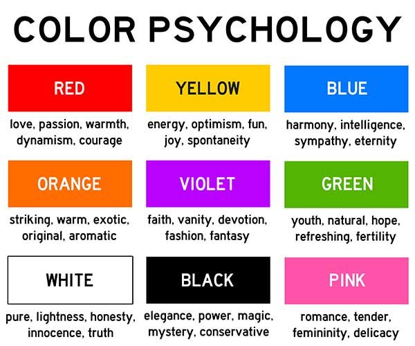
1. Red: Passion and Energy
The color red is synonymous with passion, energy, and intensity. It grabs attention and elicits strong emotions. Brands often use red to create a sense of urgency or excitement. However, it’s important to exercise caution while using red excessively, as it can also signify danger or aggression.
2. Blue: Trust and Stability
Blue is known for its calming and trustworthy qualities. It conveys a sense of security and stability, making it an ideal choice for corporate brands. Lighter shades of blue can evoke feelings of tranquility, while darker blues can symbolize strength and authority.

3. Yellow: Optimism and Happiness
Yellow is associated with joy, optimism, and warmth. It radiates positivity and is often used to draw attention or convey a sense of cheerfulness. However, excessive use of yellow can be overwhelming and create feelings of anxiety or caution.
4. Green: Harmony and Growth
Green is closely tied to nature, symbolizing growth, harmony, and balance. It is often used to promote environmental causes or products related to health and well-being. Lighter shades of green can evoke a soothing effect, while darker greens represent wealth and abundance.
5. Purple: Creativity and Luxury
Purple has long been associated with royalty, luxury, and creativity. It carries an air of sophistication and elegance, making it an excellent choice for brands that want to portray a sense of uniqueness and exclusivity. However, overusing purple can create a sense of arrogance or extravagance.
6. Orange: Energy and Vitality
Orange is a vibrant and energetic color that stimulates enthusiasm and excitement. It is often used to create a sense of urgency or draw attention to specific elements. Orange is also associated with affordability and can be an effective color choice for brands targeting budget-conscious consumers.
7. Pink: Femininity and Playfulness
Pink is widely recognized as a color associated with femininity, tenderness, and playfulness. It is often used in designs targeting a female audience or to evoke a sense of sweetness and romance. However, it’s essential to consider cultural connotations of pink, as it can vary across different societies.
8. Black and White: Simplicity and Sophistication
Black and white are classic color choices that represent simplicity, elegance, and timelessness. They create a high contrast, allowing other design elements to stand out. Black exudes power and authority, while white signifies purity and cleanliness. The combination of black and white can create a sophisticated and modern aesthetic.
Applying Color Psychology in Graphic Design
Understanding the impact of colors on human psychology allows graphic designers to strategically incorporate them into their designs for maximum effect. Here are some key considerations when applying color psychology in graphic design:
1. Branding and Identity
Colors play a vital role in shaping a brand’s identity. By carefully selecting colors that align with the brand’s values and personality, designers can create a strong and consistent visual representation. Consistency in color usage across different marketing materials and platforms helps build brand recognition and establish a memorable brand image.
2. Target Audience
Consider the preferences, cultural backgrounds, and demographics of the target audience when choosing colors for a design. Different colors evoke different emotions and have varying connotations across cultures. Tailoring the color palette to resonate with the intended audience enhances the design’s effectiveness and strengthens the connection between the brand and its consumers.
3. Mood and Tone
Colors have the power to set the mood and tone of a design. For example, warm colors like red, orange, and yellow can create a sense of energy and excitement, while cool colors like blue and green can evoke calmness and serenity. Understanding the desired emotional response from the audience allows designers to select colors that align with the intended mood and effectively convey the desired message.
4. Contrast and Readability
Contrast is crucial in graphic design to ensure readability and visual hierarchy. By using contrasting colors, designers can make important elements stand out and guide the viewer’s attention. High contrast between text and background improves legibility, especially in digital interfaces. Consider the accessibility aspect as well, ensuring that color choices accommodate individuals with visual impairments.
5. Harmonious Color Schemes
Creating harmonious color schemes is essential for a visually pleasing design. Designers often use color theory principles, such as complementary, analogous, or monochromatic color schemes, to create balanced and cohesive visuals. Harmonious color combinations enhance the overall aesthetics and make the design more visually appealing.
Graphic design is an art form that goes beyond mere aesthetics. By harnessing the power of color psychology, designers can create visually compelling and emotionally engaging experiences for users. Understanding the impact of different colors on human perception and behavior allows designers to communicate messages effectively, establish brand identity, and forge a connection with the target audience.
Remember, while color psychology is a valuable tool, it is important to consider other factors such as user experience, content quality, and website performance to achieve optimal search engine rankings. Incorporating these elements in conjunction with thoughtful and strategic graphic design can elevate your online presence and set your website apart from the competition.